Kazuki Ueda
Portfolio

Pintio / Mobile App

Pintio — Your Food Map, Visit Log & Spending Tracker in One

An iOS app that turns receipt photos into AI-powered visit records with spending insights.
Built solo from concept to App Store over 12 months.

Role

Product Designer & Solo Dev

Duration

Mar 2025 – Present (12 mo)

Platform

iOS — React Native / Expo

Background

5+ yrs Product Designer (Japan)

12

Months SOLO DEV

30+

Screens Designed

6

Currencies Supported

2

Languages (EN/JP)

02

Why I Built This

"In Sydney, every café had a proper espresso machine — the coffee culture blew me away. I kept thinking: I want to remember this place, and that one, and track how much I'm actually spending. But no app did all of that."

Personal Itch

Visited Australia and realised there was no single app for finding good food spots, logging visits, and keeping track of what I spent.

Market Gap

Google Maps knows where you've been — but not what you ate or paid. No app combined discovery, visit logging, spending, and a social feed of friends' spots.

Builder's Challenge

I'd never built an app from scratch. I wanted to take a product from 0→1 solo — design, code, and ship — to prove I could own the full cycle.

03

The Problem

There's no single app where you can find a great place to eat, record that you went, and see how much you've been spending.
People use Google Maps to discover, a notes app to remember, and nothing to track the cost.

Product Design

UX Research

Frontend Dev

Backend

Solo — End to End

Capability
Google Maps
Yelp / Tabelog
Pintio
Discover nearby places
Record visit history
⚠️
GPS auto-tracking (Timeline). Passive — knows where, not what you ate or spent.
⚠️
Manual check-in or review-based. No auto-logging.

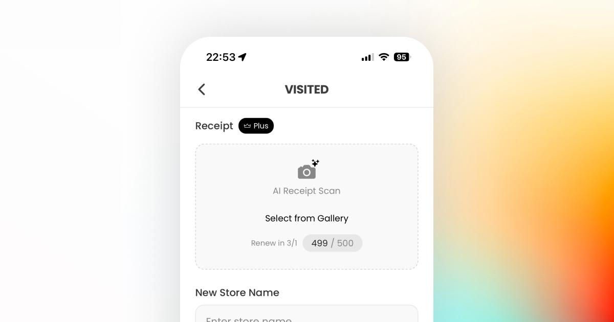
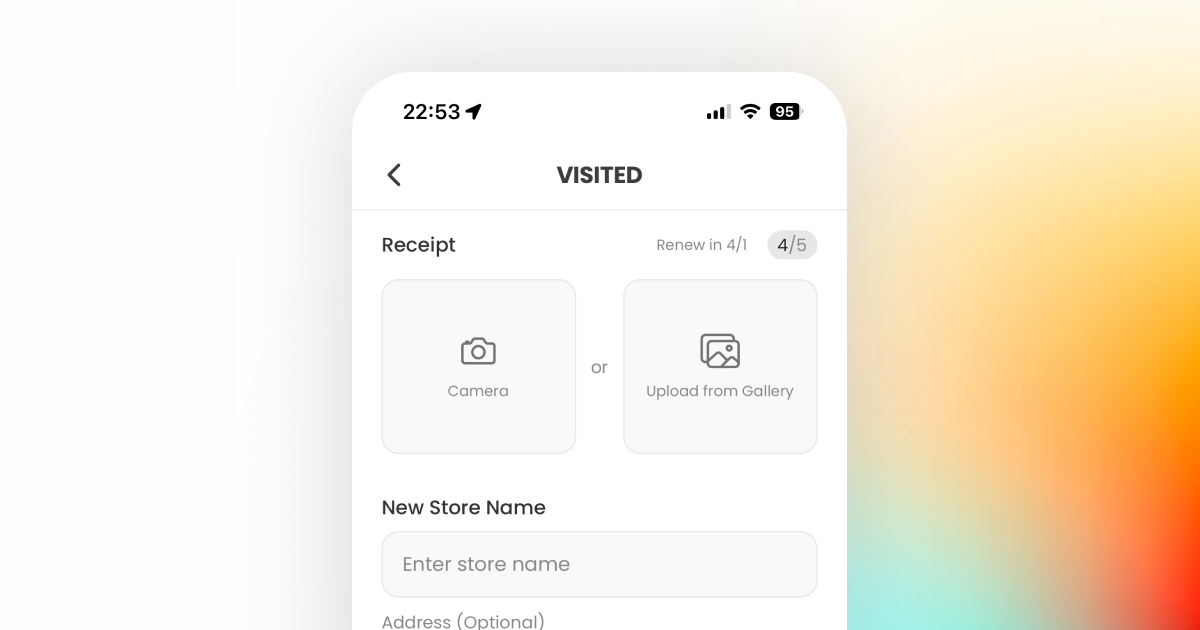
Receipt photo → AI extracts store, items, amount, date. Active, detailed record.
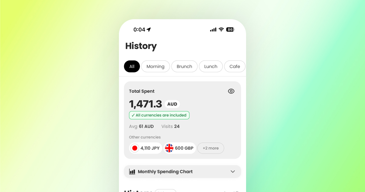
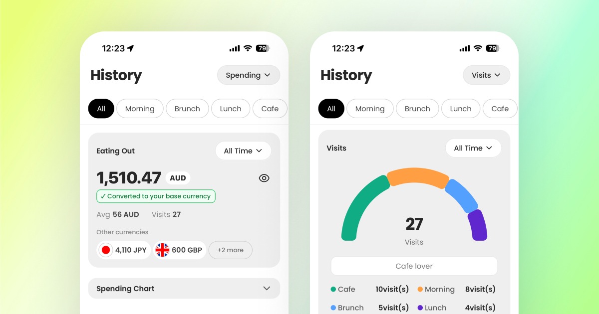
Spending tracking (multi-currency)
✅ 6 currencies
Receipt scan → auto log
✅ GPT-4 Vision
Friends’ visit history
⚠️
Shared lists exist. No automatic visit feed.
⚠️
Reviews & check-ins visible. Collections shareable.
✅ Follow-based
Automatic feed of friends’ visited places on map.
Facility filters (Wi-Fi, power)
⚠️
Text search only. No structured filter.
⚠️
Mentioned in reviews. No dedicated filter.
✅ Dedicated toggles for Wi-Fi, power, category.

Key insight: Google Maps passively records where you were. Pintio actively records what you experienced and spent. The difference is Timeline vs Journal.

04

How the Product Evolved

Pintio changed direction three times. Each pivot came from hitting a real wall, not from a whiteboard exercise.

1

B2B-First → B2C-First (The Chicken & Egg)

Early 2025 — Marketplace cold-start problem

Before

I started by building for store owners — even shipped a Next.js admin dashboard. But no owner was going to sign up for a platform with zero users.

Insight

Classic chicken-and-egg problem. In a marketplace, demand has to come before supply.

After

Flipped the entire priority to the consumer app. The dashboard wasn't wasted — it's sitting ready for when the user base is there.

2

Official-Only → User-Generated Platform

Sep 2025 — Hitting the scalability wall

Before

Only stores registered by their owners showed up. Getting each one onboarded was slow, and the map felt empty.

Insight

Users kept asking "can I add my own favourite spot?" That was the signal — let them build the database.

After

Anyone can add a store. Quality control built in: a place auto-publishes once 20 unique visitors have logged it.

3

Café-Only → All-Category Food Map

Feb 2026 — Expanding the market

Before

Pintio started as a café-only app. That felt focused, but the addressable market was too small to grow.

Insight

The real value wasn't "cafés" — it was "tracking where you eat and what you spend." The category didn't matter.

After

Opened up to restaurants, bakeries, bars — any food spot. The database architecture handled it with minimal migration.

05

Design Decisions That Mattered

Not every screen was interesting. These three moments show how I think about product design problems.

Before

After

After

UX Redesign

Receipt Scan UI Overhaul

User testing revealed that "Select from Gallery" was invisible. Fixing it introduced a layout constraint I hadn't expected.

Problem

The original design put "AI Receipt Scan" and "Select from Gallery" inside a single box. In testing, users could find the scan button, but when asked to upload from their gallery, they didn't know where to tap. The two actions looked like one.

Decision

First instinct: split them into two separate boxes. But stacking vertically would make an already long form even longer. So I placed them side by side — "Camera" and "Upload from Gallery" as equal-weight options with "or" between them.

Outcome

Both actions are now instantly recognisable. The horizontal layout actually saved vertical space, so the form fields below feel less overwhelming too. No more "where's the gallery option?" confusion.

Before

After

After

Flow Redesign

Onboarding Architecture

The problem wasn't just too many slides — it was a flow that forced commitment before showing any value.

Problem

The original flow was a straight line: Onboarding → Registration → Profile Setup → Ready to Explore. Every user had to create an account before seeing a single store on the map. No way to just look around first.

Decision

Redesigned the flow with a branch: after a 2-slide intro, users choose Guest Mode (straight to the map) or Registration. Guest mode gives full browsing access — signup happens naturally once they see the value. Also updated the intro copy from "Find your favorite store" to "Track your visits, build your own food map" to reflect the real product proposition.

Outcome

Guest users reach the map in under 10 seconds. Registration is no longer a gate — it's a choice users make after experiencing the app. Mixpanel tracking is in place to compare guest-to-signup conversion rate post-launch.

Before

After

After

User Psychology

Reframing Data: Spending vs Visit Count

TestFlight revealed something I didn't expect: watching your spending go up made people feel bad about using the app.

Problem

The history screen originally showed cumulative spending front and centre. Receipt scans logged the amount, and the total kept climbing. During testing, users felt guilty seeing the number grow — it turned a fun record into a reminder of how much they'd spent.

Decision

Instead of removing spending data, I added a second view: visit count. Users can toggle between "how much I spent" and "how many places I've been." The visit count reframes the same data as an achievement rather than a cost.

Outcome

The app now serves two mindsets: budget-conscious users who want spending insights, and explorers who want to see their journey grow. Same underlying data, completely different emotional response depending on which view you choose.

Emotional Design

Milestone Celebrations

Once visit count existed, I realised: if your map is filling up, that should feel like an achievement — not just a number going up.

Problem

The visit count view solved the negativity problem, but it was still just a passive number. Users could see their places growing on the map, but nothing in the app acknowledged that progress.

Decision

Created two feedback tiers: a subtle toast notification for regular visits (disappears in 2.5s), and a full-screen celebration modal with confetti + haptics at milestones (10, 25, 50, 100…). The key was restraint — over-celebrating kills the effect.

Outcome

The combination works: visit count reframes the data positively, and milestones turn that growing number into moments worth coming back for. Together they support the retention hypothesis — if your map feels like it's building towards something, you keep adding to it.

How I Validated Design Decisions

No research team. No large beta group. Here's what I actually had to work with:

Dogfooding

I used Pintio as my daily café/restaurant tracker. Every friction point I hit — slow loading, awkward tap targets, confusing navigation — went straight into the backlog.

Friend Testers

A small group tried the TestFlight build. I watched their first sessions and noted where they hesitated or got stuck. Small sample, but honest signal.

AI as Design Critic

AI-generated screens gave me something to react to — a "third-party perspective" that was faster than designing from a blank canvas. I'd generate, critique, then refine.

06

How I Build: Figma → Code-First → AI Pair Programming

My workflow evolved three times in 12 months — each shift made me faster than the last.

Phase 1

Figma + YouTube + Code

Started with initial concepts in Figma, then taught myself React Native from YouTube. Used Claude's chat interface to generate code snippets and learn patterns as I went.

Phase 2

Claude Code Changed Everything

When Claude Code launched mid-project, AI moved from chat into the editor. Coding and debugging happened in real-time conversation. What used to take a day of layout work became an hour.

Result

AI Generates, I Refine

As AI accuracy improved, the workflow flipped: AI produces screens, I critique and polish. Design intent and code stay in sync because one person owns both. 30+ screens shipped solo.

07

What 12 Months of Solo Product Work Taught Me

Experience > Explanation

The original onboarding forced registration before users saw any value. I added a guest mode branch so people could explore first. Don't explain the product — let them experience it.

Solve the Cold Start First

Building the Next.js dashboard "too early" was the most useful mistake I made. It taught me marketplace sequencing the hard way: users before supply. Always.

Privacy as Default

Adding social features without guardrails is a trust killer. I defaulted to user control everywhere — public/private toggles, search visibility, follow approvals.

08

What's Next

This case study covers V1. The product — and the learning — is just getting started.

First Hypothesis to Test Post-Launch

If recording visits is valuable on its own, users will come back weekly without being prompted.

Measuring: Week 1 → Week 4 retention. If recording alone isn't enough, the next lever is social — showing users where their friends have been.

On the roadmap: Melbourne & Sydney launch. Activating the store owner dashboard (Next.js — already built). Iterating with Mixpanel data from real users.

I'm looking for a Product Designer role where I can bring this kind of end-to-end ownership to a team.