Overview
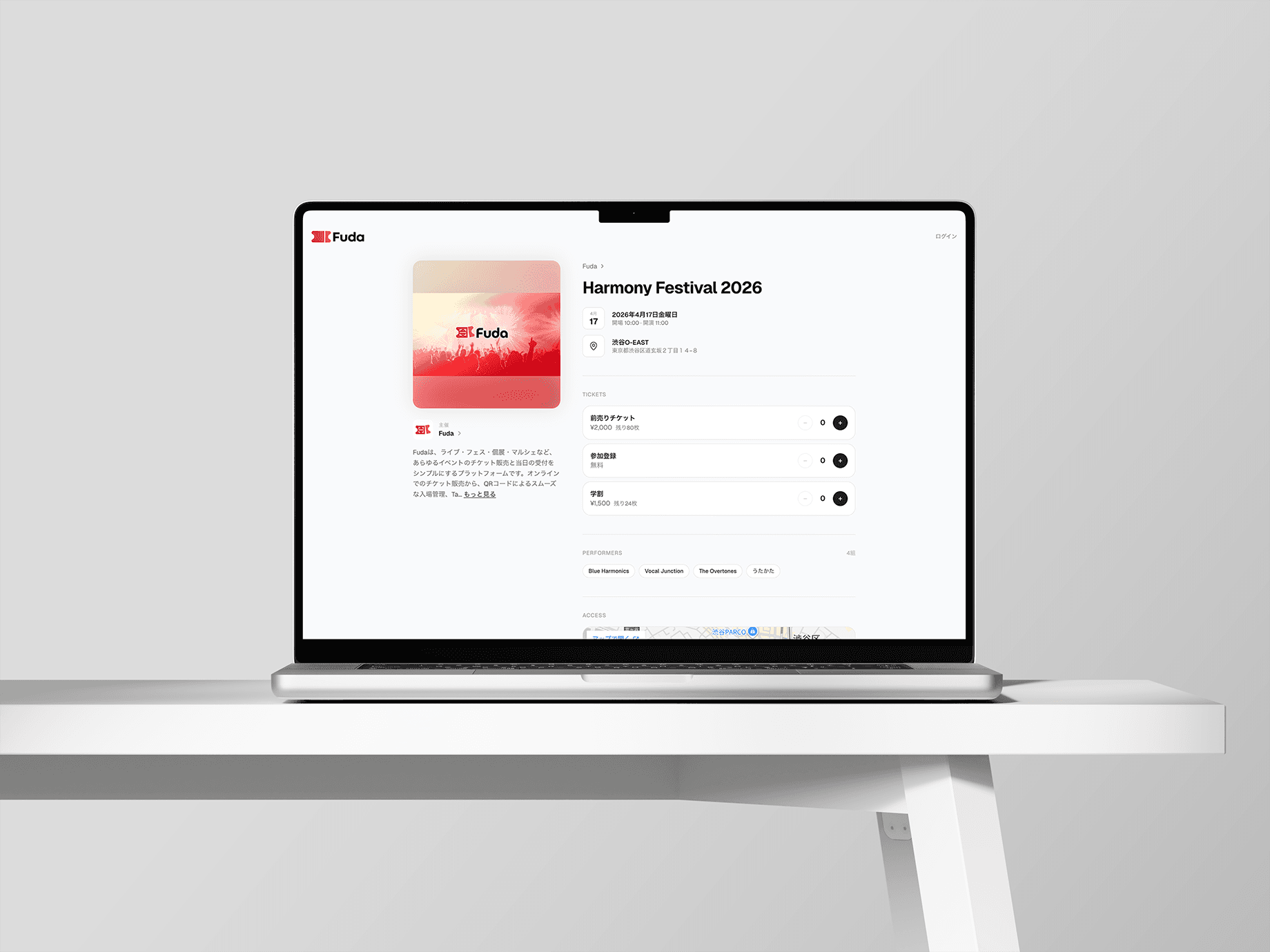
Fuda is a unified B2B event platform that enables music event organizers to manage ticket sales, gate check-ins, merchandise sales, and revenue distribution within a single ecosystem. I designed optimized, context-specific experiences across three distinct user touchpoints: attendees on mobile web, organizers on desktop, and gate staff on iOS.
To handle on-site card payments on the event day, the dedicated iOS app leverages Tap to Pay on iPhone, allowing venue staff to accept contactless payments directly on their smartphones without requiring additional card-reader hardware.

Background & Problem: Transitioning from Custom Code to a Scalable Platform
Fuda was born from my hands-on experience running live music events for "Global Sound," a local vocal music group, since 2024. What started as building simple custom ticket forms quickly hit a scalability wall during our second event: changing event layouts forced me to copy-paste and rewrite form logic from scratch. Realizing this manual approach was unsustainable, I set out to build a multi-tenant platform. The sudden shutdown of a popular low-fee ticketing service in our local community further validated the market need and accelerated development.
While architecting the service, I targeted specific UX flaws commonly found in legacy Japanese ticketing platforms (e.g., LivePocket, PassMarket)
① The Mandatory Login Barrier at Checkout
Forcing buyers to create an account before purchasing is a major conversion killer. Fuda eliminates this friction entirely with a mobile-first checkout flow, allowing spectators to complete ticket purchases in under 5 minutes using just an email, name, and payment method (Credit Card or PayPay).
② Entrance Friction: Slow QR Code Loading under Poor Connectivity
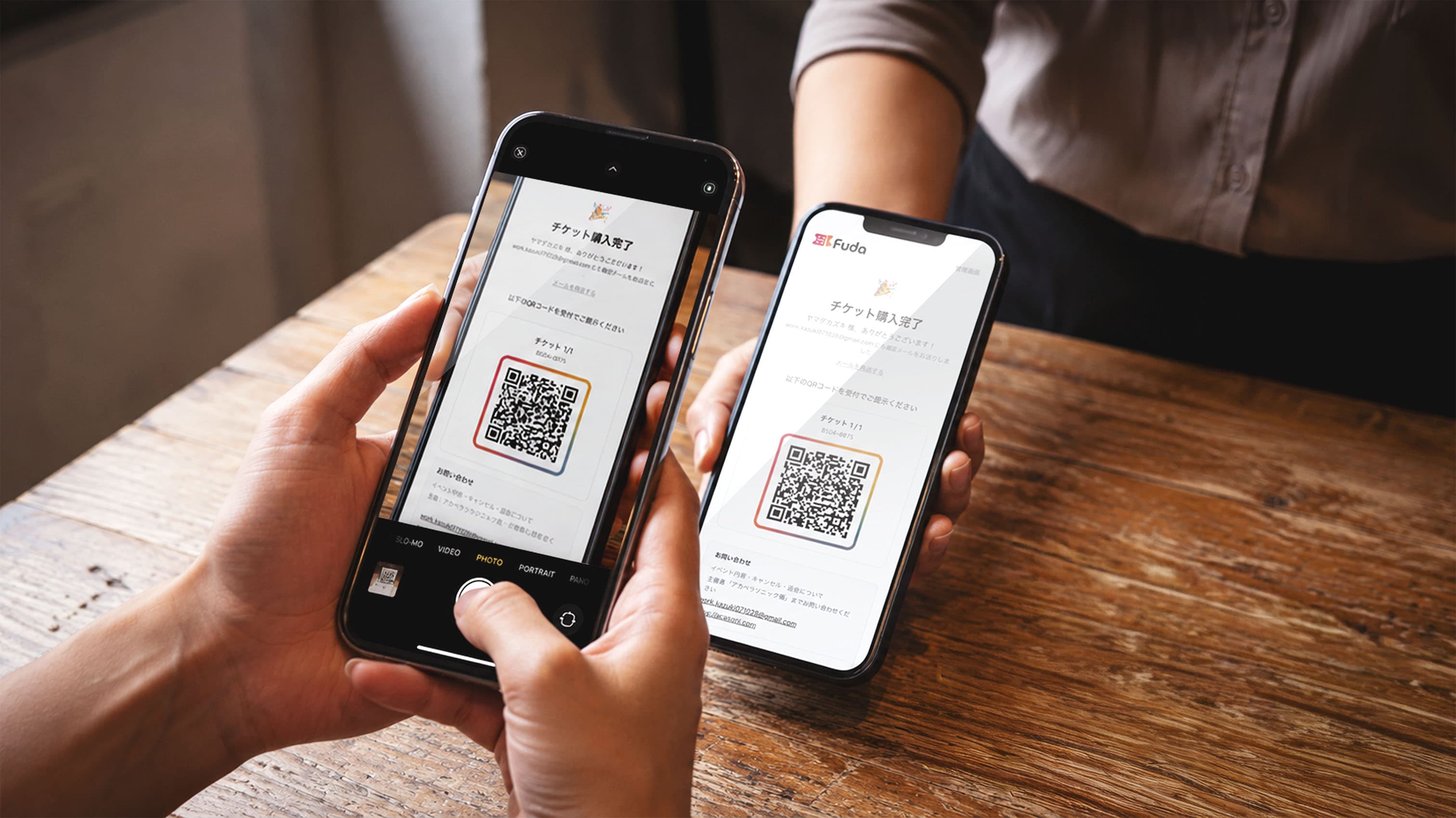
Live music venues often suffer from terrible cellular reception, causing entrance gate bottlenecks when attendees cannot load their web-based QR codes. To solve this, I engineered an offline-first iOS app for gate staff. Upon launching near connectivity, the app caches the complete attendee roster to a local database, enabling smooth, offline QR scanning for hundreds of guests.
③ Gate Vulnerabilities in Edge Cases
When attendees present dead phones or forget to screenshot their passes, legacy systems make verification painful. Fuda’s staff app keeps the cached attendee list instantly searchable by name or email, allowing staff to verify payment status and admit guests without delaying the queue.
Strategic Trade-offs: Shipping the Core MVP in 3 Months

To launch a production-ready system in just 3 months for an upcoming live show, I ruthlessly prioritized core operational mechanics—mobile web checkout, rapid gate check-in, and on-site payments—while deliberately deferring secondary features.
TARGET SCOPE | DECISION & STRATEGIC TRADEOFF |
|---|---|
Spectator UI | Skipped building a native spectator app or complex reserved seating. Prioritized a frictionless mobile-web purchase flow to maximize conversion. |
Event Discovery | Omitted a public event directory. Organizers drive traffic directly to unique event URLs via their own social channels (e.g., X/Twitter). |
On-Site POS | Heavily invested time into integrating Tap to Pay on iPhone. While "cash-only door tickets" were the industry norm in indie music scenes, bringing contactless payments directly to staff smartphones removed hardware barriers and modernized the venue entry experience. |
Marketing Landing Page | Kept the initial marketing LP strictly minimal, reallocating design and engineering bandwidth toward core checkout stability and gate app performance. |
Service Design: Security, Privacy, and Role-Based Access Control (RBAC)
Initially, I designed the platform around two user roles: Spectators and Organizers. However, while developing the organizer dashboard and seeing real revenue numbers, payout metrics, and customer PII populate the screen, a crucial security concern emerged.
Using a single master account meant organizers would have to share sensitive admin credentials with volunteer gate staff, exposing total financial analytics and private buyer data to door workers. For larger organizers hiring external gig workers, this lack of financial isolation was a total dealbreaker.
To solve this, I introduced a dedicated On-Site Staff role built on strict Role-Based Access Control (RBAC):
- Financial Isolation: Total revenue, payout schedules, and customer PII are completely hidden from staff accounts.
- Hyper-Focused Operational Scope: The staff UI is restricted strictly to two high-frequency actions: QR code scanning and Tap to Pay collection.
- Gate-Optimized Ergonomics: Designed for high-stress, one-handed operation with high-contrast status feedback and offline resilience.
Niche Cultural Features: Native Performer Attribution Systems
Indie music and student networks rely heavily on tracking sales quotas per performer. On legacy platforms, buyers manually type a performer’s name into an open text field at checkout, leaving organizers with messy data to reconcile after the event.
Fuda solves this natively. Organizers can generate unique tracking URLs with embedded parameters for each performer with a single click. Performers simply share their custom link via messaging apps (e.g., LINE). When a fan purchases a ticket, the sale automatically maps to that specific performer on the organizer’s real-time dashboard, eliminating buyer friction while automating post-event reconciliation.
Harmony Festival
Taro Yamada
example@usefuda.com
Intentional Experience Design: The Animated QR Ticket Wallet
While a static QR code satisfies basic entry requirements, I introduced a dedicated, motion-enhanced ticket wallet UI to increase emotional engagement and sense of ownership post-purchase.
1. Design Intent
Transform event entry from a transactional chore into an engaging, physical-feeling interaction by letting users feel their tickets are securely stored in a personal wallet.
2. Mechanics & Interaction
Using motion/react shared layouts, I built fluid opening and closing transitions over a single timeline to ensure lightweight, bug-free performance. For multi-ticket orders, users can swipe through a horizontal carousel, which stacks back together organically when closed as a physical metaphor.
3. Guardrails & System Integrity
- Zero Core Logic Changes: The interaction lives entirely on the presentation layer, keeping underlying validation and entry logic untouched.
- Accessibility First: Automatically respects
prefers-reduced-motionOS settings by disabling animations while preserving layout structure. - Cognitive Load Control: Introductory motion triggers only on the initial purchase via cookie tracking, prioritizing raw utility on subsequent views.
Design Engineering: AI-Driven Pair Programming and Interface Directing
Shipping a multi-tenant web app, a native iOS app, database architecture, and payment routing solo in 3 months required a fundamental shift in my development workflow. I treated AI models not as code generators, but as active design-critique and engineering partners.
During this project, I moved away from manual keyboard typing inside the editor. I established the structural foundations and application state architecture entirely by consulting conversational models (Claude) via natural language. On the frontend, I integrated the modular design library shadcn/ui, which drastically accelerated layout deployment speeds.
Furthermore, I utilized voice-directed tools like "Aqua Voice" alongside element-targeting extensions like "Agentation" as my primary production workflow. I directly clicked visual elements in the browser view to capture structural identifiers, passing direct verbal instructions like "reduce this padding block" or "align this container to the right" to let the AI process and refactor the underlying codebase automatically, bypassing manual directory searching.
To navigate complex system states, I prompted the AI using specific functional personas (e.g., "provide layout variants as a UX designer," "evaluate constraints as a PM"). I audited the resulting variations against system consistency, managing visual layouts and cross-screen consistency through active prompt direction while the AI handled rapid text generation.
Retrospective & Real-World Validation
Fuda successfully concluded its first live production trial managed by an external operations team, handling high-volume entrance gates with zero transaction errors across all card-present entries.
Key Learnings & Future Roadmap:
① Regional Infrastructure Limits
Identified a mid-development constraint where Stripe’s Tap to Pay SDK currently lacks Android support in the Japanese market. Expanding digital door payment coverage across broader hardware ecosystems remains a key milestone.
② Real-World Maintenance Refinements
Actively optimizing payout schedule mechanics for indie club cash flows and refactoring the iOS staff view for higher typography contrast and aggregate tally visibility.
③ Figma MCP Pipeline Integration
Planning to connect terminal setups directly to Figma vector trees via Model Context Protocol (MCP), establishing design files as the single source of truth for seamless design-to-code syncing.