Background & Challenges: Adapting Interfaces for Physical iPad Mounts and Unresolved Layouts
Caseline operates as a certified medical software application built to link on-site emergency physicians with remote specialists in hyperacute medical settings, facilitating proper diagnoses and immediate decision-making. Initially, the application layout was optimized exclusively for portrait orientation. However, when deployed inside actual hospital environments—specifically when mounted onto treatment-room stands or fixed wall-brackets—we encountered an urgent need to properly support landscape orientation.
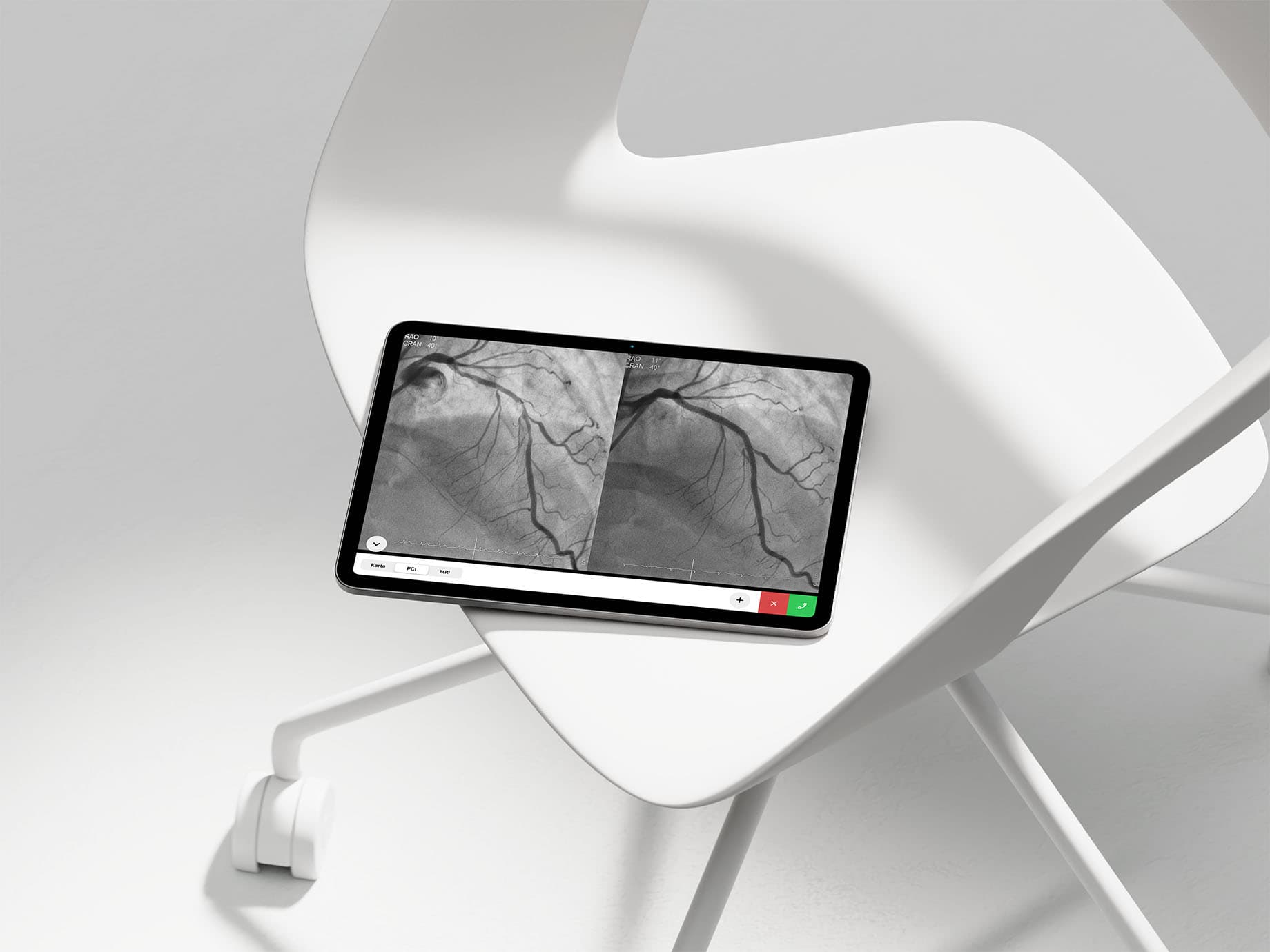
Applying the legacy portrait layout directly to wide screens resulted in a major layout issue: the vital call recipient selection panel became completely hidden off-screen. At critical moments when doctors needed to establish contact instantly, they were forced to detach the iPad from its physical stand and physically rotate the unit just to interact with the system. The lack of an orientation-agnostic interface severely damaged usability for medical workers when time was of the essence.
In tandem with this layout overhaul, we expanded the palette to introduce functional border colors surrounding the call recipient icons to enable intuitive status identification. These color specifications were successfully deployed to the production environment, directly boosting visibility for physicians operating under high-stress clinical conditions.
Collaborative Process: Moving Beyond Engineering Pitches to a Discussion-Driven "Third Solution"

To address this landscape orientation challenge, the engineering team initially presented two concrete layout choices as a starting point. Their pitches reflected distinct technical constraints and floor-level requirements: "We prefer a completely hidden state over a clipped, half-visible panel," versus "We need reliable landscape calling to support mounted stand configurations."
Given the high-velocity demands of our live product line, I decided not to just pick one of the pre-determined choices. Instead, I used those two initial pitches as a baseline for iteration, running live alignment and feedback loops with the developers. Ultimately, we arrived at an entirely new "third solution"—a fresh UI layout that bypassed the engineering constraints of both initial ideas while optimizing clear, friction-free access to decrease cognitive load for physicians in the field.
Because using live design data as the core anchor for intensive engineering alignment loops effectively served the exact purpose of structural wireframes, I deliberately omitted intermediate wireframing steps. This adaptive alignment prevented development drag and ensured the final layout specs reached production at maximum velocity.
Tactical Real-World Initiative: Trying Component-Driven Architecture in Figma for Scalable Implementation
When this feature sprint launched, our shared team pipeline lacked a centralized design system or modular UI components, meaning feature expansion moved forward strictly on a screen-by-screen basis. However, looking ahead to future releases, I knew that shipping layouts without a standardized baseline risked visual fragmentation and increased implementation overhead down the line.
To counter this risk within the live project, I initiated a trial to construct and organize modular UI components directly in Figma as part of the interface overhaul. I broke down individual screen layouts into clear, repeatable component parameters. This structural preparation allowed me to bridge fast-paced delivery needs with long-term visual consistency. This structural framework, along with the complete landscape overhaul, was successfully reviewed, integrated by engineering, and deployed to the live product release.
Retrospective & Alignment: Balancing Practical Speed with Long-Term System Architecture
The primary core of this design sprint was minimizing cognitive load for medical professionals operating under high pressure. Unifying landscape and portrait interactions into a single, predictable layout keeps the critical call panel exactly where users expect it, providing frictionless access to vital actions during medical emergencies.
Rather than working in a silo, I routed the live product requirements through structured internal reviews with my design manager to secure a green light while maintaining tight alignment with engineering. Balancing this hands-on, high-velocity collaboration with a systematic focus on sustainable product design defines my approach. I will continue to pair immediate execution with systematic design thinking to solve complex product problems.